Modius Data Center Blog

Using the Right Tool for the Job: Modius OpenData vs. a BMS

Posted by Marina Thiry on Thu, Jul 21, 2011 @ 12:24 PM


We are sometimes asked how Modius OpenData is different than a BMS. “Why should I consider Modius OpenData when I already have a BMS?”

In short, the answer comes down to using the right tool for the job.  A BMS is installed at a large building to monitor and control the environment within that building, for example: lighting, ventilation, and fire systems. It helps facility managers better manage the building’s physical space and environmental conditions, including safety compliance.  As concerns about energy conservation have gained critical mass, feature enhancements to BMSs have evolved to become more attuned to energy efficiency and sustainability. However, this doesn’t make a BMS a good tool for data center optimization any more than a scissors can be substituted for a scalpel.

Unlike a BMS, OpenData software by Modius was designed to uncover the true state of the data center by continually measuring all data points from all equipment, and providing the incisive decision support required to continually optimize infrastructure performance. Both facility and IT managers use OpenData to gain visibility across their data center operations, to arrive at an energy consumption baseline, and then to continually optimize the critical infrastructure of the data center—from racks to CRACs. The effectiveness of the tool used for this purpose is determined by the:

  • operational intelligence enabled by the reach and granularity of data capture, accuracy of the analytics, and the extensibility of the feature set to utilize the latest data center metrics
  • unified alarm system to mitigate operational risk
  • ease-of-use and flexibility of the tool to simplify the job

To illustrate, following are the top three differences between OpenData and a typical BMS that make OpenData the right tool to use for managing and optimizing data center performance.

  1. OpenData provides the operational intelligence, enabled by the reach and granularity of data capture, accuracy of the analytics, and the extensibility of the feature set, to utilize the latest data center metrics. Modius understands that data center managers don’t know what type of analysis they will need to solve a future problem. Thus, OpenData provides all data points from all devices, enabling data center managers to run any calculation and create new dashboards and reports whenever needed. This broad and granular data capture enables managers to confidently assess their XUE[1], available redundant capacity, and any other data center metric required for analysis. Moreover, because all of the data points provided can be computed at will, the latest data center metrics can be implemented at any time. In contrast, a BMS requires identifying a set of data points upon its installation. Subsequent changes to that data set require a service request (and service fee), which means that even if the data is collected in real-time, it may not be available to you when needed. Thus, the difficulty and expense of enabling the networked communications and reporting for real-time optimization from a BMS is far beyond what most would consider a “reasonable effort” to achieve.


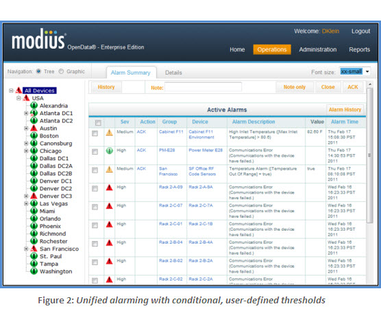
  2. OpenData provides a unified alarm system to mitigate operational risk. With OpenData, end-users can easily set thresholds on any data point, on any device, and edit thresholds at any time. Alarms can be configured with multiple levels of escalation, each with a unique action. Alarms can be managed independently or in bulk, and the user interface displays different alarm states at a glance. In contrast, with a typical BMS integration the system only reports alarms native to the device—i.e., it  doesn’t have access to alarms other than its own mechanical equipment. When data center managers take the extra steps to implement unified alarming (e.g., by feeding into the BMS the relay outputs or OPC server-to-server connections from the various subcomponents), they will often only get the summary alarms as a consequence of the cost charged per point and/or the expense of additional hardware modules and programming services to perform the communication integration with third-party equipment. Thus, when personnel receive an alarm, they have to turn to the console of the monitoring system that “owns” the alarming device to understand what is happening.
    Alarm Monitoring BMS
  3. Ease of use and flexibility to simplify the job. OpenData is designed to be user-driven: it is completely configurable by the end-user and no coding is required, period. Learning how to use OpenData takes approximately a day. For example, OpenData enables users to add new calculations, adjust thresholds, add and remove equipment, and even add new sites. In contrast, using a BMS to pro-actively make changes is virtually impossible to administer independently. Because the BMS is typically one component of a vendor’s total environmental control solution, the notion of “flexibility” is constrained to what is compatible with the rest of their solution offerings. Consequently, a BMS adheres to rigid programming and calculations that frequently require a specialist to implement changes to the configuration, data sets, and thresholds.

In summary, the only thing constant in data centers is flux. Getting the right information you need—when you need it—is crucial for data center up-time and optimization. For the purpose of performance monitoring and optimization, using a BMS is more problematic and ultimately more expensive because it is not designed for broad and granular data capture, analysis and user configuration.  Ask yourself: What would it take to generate an accurate PUE report solely using a BMS? 

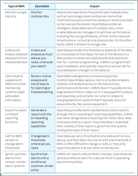
The following table summarizes key differences between OpenData and a BMS, including the impact to data center managers.

BMS OpenData DCIM


[1] The “X” refers to the usage effectiveness metric de jour, whether it is PUE, pPUE, CUE, WUE, or something new.

Topics: data center monitoring, BMS, DCIM, monitoring, optimization

Visualize Data Center Site Performance

Posted by Jay Hartley, PhD on Wed, Jul 06, 2011 @ 07:19 PM

There has been plenty of discussion of PUE and related efficiency/effectiveness metrics of late (Modius PUE Blog posts: 1, 2, 3). How to measure them, where to measure, when to measure, and how to indicate which variation was utilized. Improved efficiency can reduce both energy costs and the environmental impact of a data center. Both are excellent goals, but it seems to me that the most common driver for improving efficiency is a capacity problem. Efficiency initiatives are often started, or certainly accelerated, when a facility is approaching its power and/or cooling limits, and the organization is facing a capital expenditure to expand capacity.

When managing a multi-site enterprise, understanding the interaction between capacity and efficiency becomes even more important. Which sites are operating most efficiently? Which sites are nearing capacity? Which sites are candidates for decommissioning, efficiency efforts, or capital expansion?

For now, I will gracefully skip past the thorny questions about efficiency metrics that are comparable across sites. Let’s postulate for a moment that a reasonable solution has been achieved. How do I take advantage of it and utilize it to make management decisions?

Consider looking at your enterprise sites on a “bubble chart,” as in Figure 1. A bubble chart enables visualization of three numeric parameters in a single plot. In this case, the X axis shows utilized capacity. The Y axis shows PUE. The size of each bubble reflects the total IT power load.

Before going into the gory details of the metrics being plotted, just consider in general what this plot tells us about the sites. We can see immediately that three sites are above 80% capacity. Of the three, the Fargo site is clearly the largest, and is operating the most inefficiently. That would be the clear choice for initiating an efficiency program, ahead of even the less-efficient sites at Chicago and Orlando, which are not yet pushing their capacity limits. One might also consider shifting some of the IT load, if possible, to a site with lower PUE and lower utilized capacity, such as Detroit.

Data Center, Efficiency, Capacity

In this example, I could have chosen to plot DCiE (Data Center Infrastructure Efficiency)  vs. available capacity, rather than the complementary metrics PUE vs. utilized capacity. This simply changes the “bad” quadrant from upper right to lower left. Mainly an individual choice.

Efficiency is also generally well-bounded as a numeric parameter, between 0 and 100, while PUE can become arbitrarily large. (Yes, I’m ignoring the theoretical possibility of nominal PUE less than 1 with local renewable generation. Which is more likely in the near future, a solar data center with a DCiE of 200% or a start-up site with a PUE of 20?) Nonetheless, PUE appears to be the metric of choice these days, and it works great for this purpose.

Whenever presenting capacity as a single number for a given site, one should always present the most-constrained resource. When efficiency is measured by PUE or a similar power-related metric, then capacity should express either the utilized power or cooling capacity, whichever is greater. In a system with redundancy, be sure to that into account

The size of the bubble can, of course, also be modified to reflect total power, power cost, carbon footprint, or whatever other metric is helpful in evaluating the importance of each site and the impact of changes.

This visualization isn’t limited to comparing across sites. Rooms or zones within a large data center could also be compared, using a variant of the “partial” PUE (pPUE) metrics suggested by the Green Grid. It can also be used to track and understand the evolution of a single site, as shown in Figure 2.

This plot shows an idealized data-center evolution as would be presented on the site-performance bubble chart. New sites begin with a small IT load, low utilized capacity, and a high PUE. As the data center grows, efficiency improves, but eventually it reaches a limit of some kind. Initiating efficiency efforts will regain capacity, moving the bubble down and left. This leaves room for continued growth, hopefully in concert with continuous efficiency improvements.

Finally, when efficiency efforts are no longer providing benefit, capital expenditure is required at add capacity, pushing the bubble back to the left.

Those of you who took Astronomy 101 might view Figure 2 as almost a Hertzsprung-Russell diagram for data centers!

Whether tracking the evolution of a single data center, or evaluating the status of all data centers across the enterprise, the Data Center Performance bubble chart can help understand and manage the interplay between efficiency and capacity.

Data Center Capacity

Topics: Capacity, PUE, data center capacity, data center management, data center operations, DCIM

Data Center Monitoring in the Cloud

Posted by Jay Hartley, PhD on Tue, Jun 21, 2011 @ 11:24 AM

modius, opendata, logoModius OpenData has recently reached an intriguing milestone. Over half of our customers are currently running the OpenData® Enterprise Edition server software on virtual machines (VM). Most new installations are starting out virtualized, and a number of existing customers have successfully migrated from a hard server to a virtual one.

In many cases, some or all of the Collector modules are also virtualized “in the cloud,” at least when gathering data from networked equipment and network-connected power and building management systems. It’s of course challenging to implement a serial connection or tie into a relay from a virtual machine. It will be some time before all possible sensor inputs are network-enabled, so 100% virtual data collection is a ways off. Nonetheless, we consider greater than 50% head-end virtualization to be an important achievement.

This does not mean that all those virtual installations are running in the capital-C Cloud, on the capital-I Intranet. Modius has hosted trial proof-of-concept systems for prospective customers on public virtual machines, and a small number of customers have chosen to host their servers “in the wild.” The vast majority of our installations, both hardware and virtual, are running inside the corporate firewall.

Data Center, Virtualization, Monitoring Many enterprise IT departments are moving to a virtualized environment internally. In many cases, it has been made very difficult for a department to purchase new actual hardware. The internal “cloud” infrastructure allows for more efficient usage of resources such as memory, CPU cycles, and storage. Ultimately, this translates to more efficient use of electrical power and better capacity management. These same goals are a big part of OpenData’s fundamental purpose, so it only makes sense that the software would play well with a virtualized IT infrastructure.
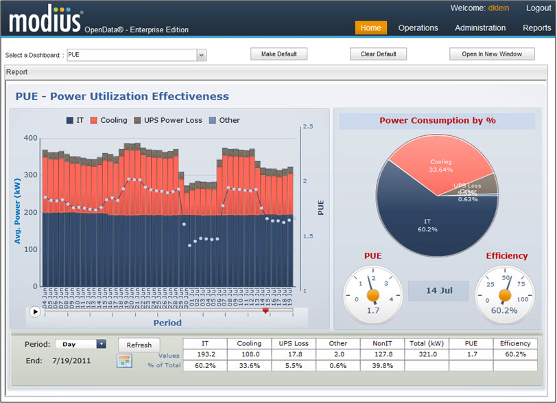
There are two additional benefits of virtualization. One is availability. Whether hardware or virtual, OpenData Collectors can be configured to fail-over to a secondary server. The database can be installed separately as part of the enterprise SAN. If desired, the servers can be clustered through the usual high-availability (HA) configurations. All of these capabilities are only enhanced in a highly distributed virtual environment, where the VM infrastructure may be able to dynamically re-deploy software or activate cluster nodes in a number of possible physical locations, depending on the nature of the outage.

Even without an HA configuration, routine backups can be made of the entire virtual machine, not simply the data and configurations. In the event of an outage or corruption, the backed-up VM can be restored to production operation almost instantly.

The second advantage is scalability. Virtual machines can be incrementally upgraded in CPU, memory, and storage capabilities. With a hardware installation, incremental expansion is a time-consuming, risky, and therefore costly, process.  It is usually more cost-effective to simply purchase hardware that is already scaled to support the largest planned installation. In the meantime, you have inefficient unused capacity taking up space and power, possibly for years. On a virtual machine, the environment can be “right sized” for the system in its initial scope.

Overall, the advantages of virtualization apply to OpenData as with any other enterprise software. Lower up-front costs, lower long-term TCO, increased reliability, and reduced environmental impact.  All terms that we at Modius, and our customers, love to hear.

Topics: Energy Efficiency, DCIM, monitoring, optimization, Energy Management, Energy Analysis, instrumentation

Latest Modius Posts

Posts by category

Subscribe via E-mail