Modius Data Center Blog

Visualize Data Center Site Performance

Posted by Jay Hartley, PhD on Wed, Jul 06, 2011 @ 07:19 PM

There has been plenty of discussion of PUE and related efficiency/effectiveness metrics of late (Modius PUE Blog posts: 1, 2, 3). How to measure them, where to measure, when to measure, and how to indicate which variation was utilized. Improved efficiency can reduce both energy costs and the environmental impact of a data center. Both are excellent goals, but it seems to me that the most common driver for improving efficiency is a capacity problem. Efficiency initiatives are often started, or certainly accelerated, when a facility is approaching its power and/or cooling limits, and the organization is facing a capital expenditure to expand capacity.

When managing a multi-site enterprise, understanding the interaction between capacity and efficiency becomes even more important. Which sites are operating most efficiently? Which sites are nearing capacity? Which sites are candidates for decommissioning, efficiency efforts, or capital expansion?

For now, I will gracefully skip past the thorny questions about efficiency metrics that are comparable across sites. Let’s postulate for a moment that a reasonable solution has been achieved. How do I take advantage of it and utilize it to make management decisions?

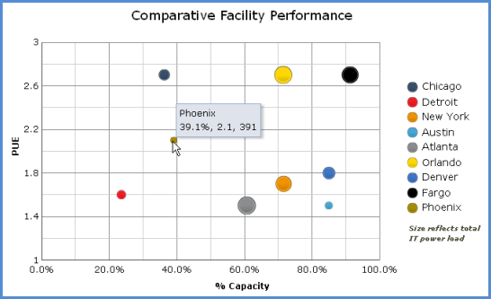
Consider looking at your enterprise sites on a “bubble chart,” as in Figure 1. A bubble chart enables visualization of three numeric parameters in a single plot. In this case, the X axis shows utilized capacity. The Y axis shows PUE. The size of each bubble reflects the total IT power load.

Before going into the gory details of the metrics being plotted, just consider in general what this plot tells us about the sites. We can see immediately that three sites are above 80% capacity. Of the three, the Fargo site is clearly the largest, and is operating the most inefficiently. That would be the clear choice for initiating an efficiency program, ahead of even the less-efficient sites at Chicago and Orlando, which are not yet pushing their capacity limits. One might also consider shifting some of the IT load, if possible, to a site with lower PUE and lower utilized capacity, such as Detroit.

Data Center, Efficiency, Capacity

In this example, I could have chosen to plot DCiE (Data Center Infrastructure Efficiency)  vs. available capacity, rather than the complementary metrics PUE vs. utilized capacity. This simply changes the “bad” quadrant from upper right to lower left. Mainly an individual choice.

Efficiency is also generally well-bounded as a numeric parameter, between 0 and 100, while PUE can become arbitrarily large. (Yes, I’m ignoring the theoretical possibility of nominal PUE less than 1 with local renewable generation. Which is more likely in the near future, a solar data center with a DCiE of 200% or a start-up site with a PUE of 20?) Nonetheless, PUE appears to be the metric of choice these days, and it works great for this purpose.

Whenever presenting capacity as a single number for a given site, one should always present the most-constrained resource. When efficiency is measured by PUE or a similar power-related metric, then capacity should express either the utilized power or cooling capacity, whichever is greater. In a system with redundancy, be sure to that into account

The size of the bubble can, of course, also be modified to reflect total power, power cost, carbon footprint, or whatever other metric is helpful in evaluating the importance of each site and the impact of changes.

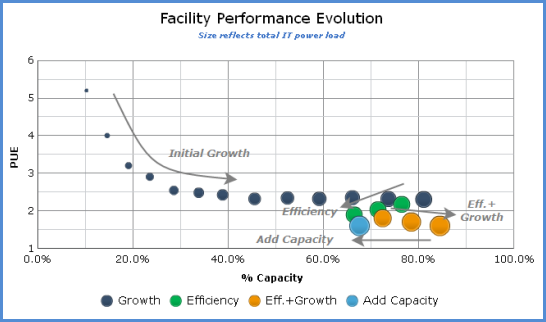
This visualization isn’t limited to comparing across sites. Rooms or zones within a large data center could also be compared, using a variant of the “partial” PUE (pPUE) metrics suggested by the Green Grid. It can also be used to track and understand the evolution of a single site, as shown in Figure 2.

This plot shows an idealized data-center evolution as would be presented on the site-performance bubble chart. New sites begin with a small IT load, low utilized capacity, and a high PUE. As the data center grows, efficiency improves, but eventually it reaches a limit of some kind. Initiating efficiency efforts will regain capacity, moving the bubble down and left. This leaves room for continued growth, hopefully in concert with continuous efficiency improvements.

Finally, when efficiency efforts are no longer providing benefit, capital expenditure is required at add capacity, pushing the bubble back to the left.

Those of you who took Astronomy 101 might view Figure 2 as almost a Hertzsprung-Russell diagram for data centers!

Whether tracking the evolution of a single data center, or evaluating the status of all data centers across the enterprise, the Data Center Performance bubble chart can help understand and manage the interplay between efficiency and capacity.

Data Center Capacity

Topics: Capacity, PUE, data center capacity, data center management, data center operations, DCIM

Illuminating DCIM tools: Asset Management vs. Real-time Monitoring

Posted by Donald Klein on Wed, Dec 15, 2010 @ 11:26 AM

Gartner DCIM ModiusIn the news recently, there has been a lot of discussion around a new category of software tools focusing on unified facilities and IT management in the data center.  These tools have been labeled by Gartner as Data Center Infrastructure Management (DCIM), of which Modius OpenData is a leading example (according to Gartner).

In reality, there are multiple types of tools in this category - Asset Management systems and Real-time Monitoring systems like Modius.  The easiest way to understand the differences is to reflect on two key elements: 

  • How the tools get the data?
  • And how time critical is the data?

Generally speaking, data center Asset Management systems, like nlyte, Vista, Asset-Point, Alphapoint, etc., are all reliant on 3rd party sources to either facilitate data entry of IT device 'face plate' specs, or are fed collected data for post process integration. 

The data processing part is what these systems do very effectively, in that they can build a virtual model of the data center and can often predict what will happen to the model based on equipment 'move, add or change' (MAC). These products are also strong at utilizing that model to build capacity plans for physical infrastructure, specifically power, cooling, space, ports, and weight. 

To ensure that the data used is as reliable as possible the higher priced systems contain full work-flow and ticketing engines. The theory being that by putting in repeatable processes and adhering to them, the MAC will be entered correctly in the system. To this day, I have not seen a single deployed system that is 100% accurate.  But for the purposes they are designed for (capacity and change management), these systems work quite well.

Real time accurate dataHowever, these systems are typically not used for real-time alarm processing and notification as they are not, 1) Real-time, and 2) Always accurate.

Modius takes a different approach.  As compared with Asset Management tools, Modius gets its data DIRECTLY from the source (i.e. the device) by communicating in its native protocol (like Modbus, BACnet, and SNMP) versus theoretical 'face plate' data from 3rd party sources.  The frequency of data collection can vary from 1 poll per minute, to 4 times a minute (standard), all the way down to the ½ second.  This data is then collected, correlated, alarmed, stored and can be reported over minutes, hours, days, weeks, months or years. The main outputs of this data are twofold:

  • Modius AlarmsCentralized alarm management across all categories of equipment (power, cooling, environmental sensors, IT devices, etc.)
  • Correlated performance measurement and reporting across various catagories (e.g. rack, row, zone, site, business unit, etc.)

Modius has pioneered real-time, multi-protocol data collection because the system has to be accurate 100% of the time.  Any issue in data center infrastructure performance could lead to a failure that could affect the entire infrastructure.  This data is also essential in optimizing the infrastructure in order to lower cooling costs, increase capacity, and better management equipment.

Both types of tools -- Asset Management tools and Real-time Monitoring systems -- possess high value to data center operators utilizing different capabilities.  The Asset tools are great for planning, documenting, and determining the impacts of changes in the data center.  Modius real-time monitoring interrogates the critical infrastructure to make sure systems are operating correctly, within environmental tolerances, and established redundancies.  Both are complimentary tools in maintaining optimal data center performance.

Because of this inherent synergy, Modius actively integrates with as many Asset Management tools as possible, and supports a robust web services interface for bi-directional data integration. To find out more, please feel free to contact Modius directly at info@modius.com.

Topics: Data-Collection-and-Analysis, data center capacity, data center operations, real-time metrics, Data-Collection-Processing, data center infrastructure, IT Asset Management

Do I really need $1M to make my Data Center HVAC system smarter? ...

Posted by Donald Klein on Wed, Sep 22, 2010 @ 01:03 PM

... Or is there a cheaper alternative?

The latest advent in data center cooling is intelligent networked HVAC systems.  The HVAC systems are intelligently managed to allow remote sensors to provide feedback so that the HVAC system can tune cooling to meet the dynamic demand of the IT infrastructure.  The systems are “intelligent” in that they can change the speeds/frequency of the fan (VFD) to provide more or less air to the cooling zones and cabinets supported by the cooling system.  Further, they can auto-engage the economizer (for ambient cooling) and control water valves to provide greater efficiency to powering air-conditioning units.  They are also on a network so that they can be controlled in total rather than only independently, with one turning up while another could be throttling down. 

Data Center HVACAll very, very, cool stuff and can greatly influence one of the largest data center cost, powered cooling.  Ok, now the downside, wow.. is it really $1M to do it.  In most cases, the answer is yes. The cooling system manufacturers are hoping that you will replace your existing system and allow them to generate a services engagement for them to spend the next year turning up and tuning the system. 

Data Center IntelligenceSo here is the question … Is there any way to make my existing HVAC smarter and NOT spend the $1M??  Glad you asked and yes there is.  Before spending that cash, there are three steps you can take in making your existing more efficient and they include:

  1. Installing Variable frequency drives
  2. Unifying data from temp/humidity monitoring at the cabinet
  3. Compute, measure, and integrate into the BMS


Step 1. Install Variable Frequency Drives for controlling airflow

Data Center VFDAs discussed previously in earlier blogs, VFD’s will provide the throttle necessary to achieve energy efficiency.  Several states, including California, are providing rebated for installing VFD’s and pay for nearly 60% of the cost of the equipment (for more information on this topic, contact us at info@modius.com, and we can help put you in touch with the right people).  But remember … VFD’s are only as good as the control procedures you put in place to in order to modulate the cooling as required at the rack level.

Step 2. Unify data from a broad cross-section of temperature and humidity instrumentation points

Data Center InstrumentationIn order to get the best possible data about what is actually happening at the rack level, there are several practical ways to extend your temperature and humidity instrumentation across your environment.  This may include not only deploying the latest generation of inexpensive  wirefree environmental sensors, as well as unifying data that is already being captured by existing instrumentation from wired, wireless, power strip-based or server-based instrumentation.  

The most cost effective way is to leverage the environmental data  the new servers are already collecting (often referred to as chassis-level instrumentation).  The new servers from the leading three vendors register both the server inlet and exhausted temperature.  Depending on the deployment architecture, this can provide you with a lot of fidelity including front/rear, min, max, average, and standard at the bottom, middle and top of the cabinet. 

In most cases, this is enough information to provide equipment demand for direct cooling.  Where you don’t have newer servers that support temperature, wireless sensors are the next best option.  There are several vendors on the market that make these products and are nice in that they are easy to set up and you can place just about anywhere.  If you have data being generated from power strips or wired sensors, incorporate those as well (the more information, the better).

Step 3. Compute, measure, and integrate into the BMS

Building management systems are traditionally very good at controlling systems such as VFDs and recognizing critical alarms.  What they are not good at is being easy to configure, integrate or extend across the network.  This is where you need to be able to provide a booster to how data is collected and synthesized. 

Modius OpenData is used to collected real-time data across the network into potentially hundreds of new devices and thousands of newly collected points.  Once the data is collected from servers, wireless sensors, pdu’s and wired sensors the data is correlated against key performance metrics then fed to the building management system so that it may adjust the VFD’s, water flow, and economizer.  Example metrics might be:

  • Rack-by-rack temperature averages for inlet and outlet
  • Row-by-row averages with alarm thresholds for any racks which exceed the row average by a particular margin
  • Delta-T with alarms for specific thresholds

These types of computations can be based off of unified data from a variety of sources (sensors, strips, servers, etc.), all of which can be used to make your existing HVAC system smarter.  The most important point is to continually measure as you go and make a series of small or incremental optimizations based off of verified data.  The best news is that this architecture is the fraction of the cost of what new HVAC infrastructure costs and leverages your existing building management system.

Topics: data center cooling, Data-Collection-and-Analysis, Data Center PUE, data center operations, BACnet, data center temperature sensors, Data-Collection-Processing, data center infrastructure

Latest Modius Posts

Posts by category

Subscribe via E-mail